Intention
This isn’t the first domain I’ve owned, but it is the one I’ve had the longest.
As of today, it’s 8666 days old.
It’s always been an experiment.
The very first iteration of this site was imagined as a place for a group of friends to play. “Here’s some web hosting, get a blog, make some HTML, do whatever!”
Anyone remember when this was a blog with no archives, no feed, and a maximum of two posts? Each new post meant that the oldest post was gone forever.
Probably not! …Truthfully, none of the experiments are very interesting in a broad context. The primary audience has always been me. “Here’s some web hosting, play with digital impermanence!”
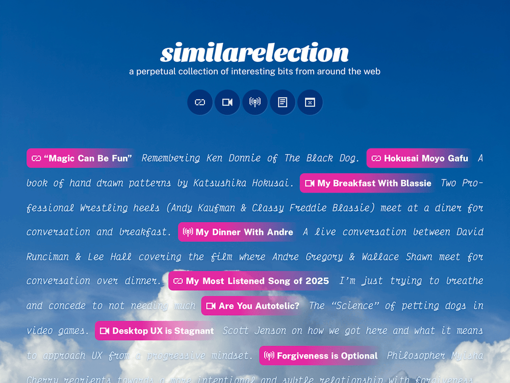
This latest experiment is a minimal, handmade, link blog.
Inspiration
In Kyle Chayka’s book Filterworld he works through how our increasingly algorithmically driven lives are changing culture. Spoiler: It’s rarely for the better.
As an antidote to this “algorithmic flattening” of culture Kyle suggests personal collection and curation.
While we have the advantage of freedom of choice, the endless array of options presented by algorithmic feeds often instills a sense of meaninglessness: I could be listening to anything, so why should any one thing be important to me? The constructive relationship between collecting and culture goes in both directions. When we find something meaningful enough to save, to add to our collection, the action both etches it a little deeper into our hearts and creates a context around the artifact itself, whether text, song, image, or video. The context is not just for ourselves but for other people, the knit-together, shared context of culture at large. That’s what Benjamin described when he wrote, “The phenomenon of collecting loses its meaning as it loses its personal owner.” Collections need individual caretakers, whose voices and tastes they express. —Kyle Chayka (Filterworld, 2025)
This link blog is my little experiment in returning to human driven web curation.
Design
Design on the web is largely boring. It wasn’t always this way. It happened over time ue to some combination of becoming a mature platform with mature tools, hyper-optimizations, and indifference.
While a link blog is a pretty straightforward list of data, I didn’t want a generic, clean, “one step removed from a spreadsheet” design.

The posts are all presented inline (each new post doesn’t start on a new line). On desktop, the copy will sometimes have too much space between words. On mobile, the copy will absolutely wrap in odd places. I’m OK with this. The size of the browser temporarily reflows the page and each new post permanently reflows the page. It’s in a continual state of imperfect flux. It may not score the highest on readability test, but I feel like it’s surprisingly easy to scan the title for something that grabs your attention then read the associated description.
Functionality
Creating a link blog for a single user was a fun experiment in and of it’s self. Most of the work went into the back end. I didn’t have to design for a myriad of perspectives and approaches. No worring about aspects being misunderstood. No need to guide a user through a workflow.
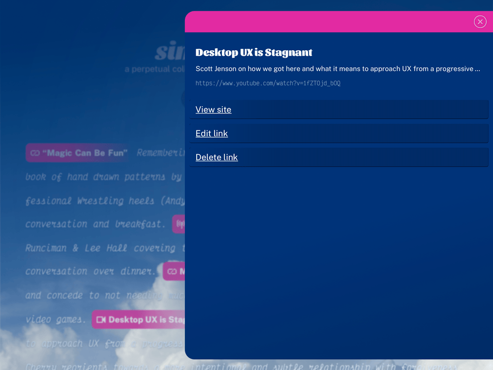
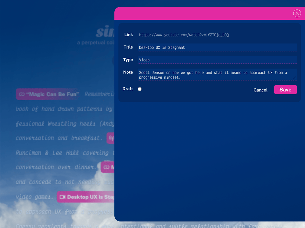
The CRUD functionality happens in a slide out admin panel on the homepage. If I’m logged in, all of the links on the homepage are overridden. Rather than the expected behavior of opening the linked to site, they open the sidebar with management actions. I rarely need to visit a site again. I’ve already seen it. I do need to edit the information associated with a link (writing good short descriptions is going to take practice). Any post saved as a draft is also shown to me within the homepage link list. This saves the need to go to a separate page with a separate view of all the posts to edit and delete them.
Along the same lines, there’s no preview functionality. Instead, the display of new posts is delayed by 10 minutes. But only to the public. I see it instantly. The normal homepage is the preview. If there’s ever an instance where I need more than 10 minutes to get something right, I can mark it as a draft. Then the normal homepage is still the preview.

Quality of life
Modern web page titles and urls are full of cruft. Tracking cruft. SEO cruft. Mystery cruft. The Open Graph data is often cleaner. I have a little utility that will try to grab that info and pre-populate the title and url for a post. It also displays the Open Graph description under the post form, so I can reference it when writing my own.
I say “try” because many big sites (YouTube, Medium, etc) block my shared hosting IP from that sort of scraping. There’s probably a way to trick them. Looking into it is on my todo list.

I can quickly make a new post using a simple MacOS / iOS Shortcut tied to the OS level share sheet. It passes the current Safari URL and title to the homepage. When the page see’s those attributes it slides open the sidebar with the new post form. That form will attempt to get Open Graph data for the passed URL. If it fails, it will pre-fill the form with that same passed info.
Conclusion
There are still many things to do (like better image handling in these stand alone post pages). There are always things to do…
I’m enjoying this workflow. It’s fast and it’s straightforward. Perfect for such a simple application. And for successfully creating a new curation habit.
